SpiceBox Organics is Hong Kong’s premier one-stop shop for all things organic and enjoyable, and I’m proud to have had them as a major client since 2014. In our latest work together, we’ve redesigned their entire in-house blend packagings to increase sales and bring the brand a fresh image.
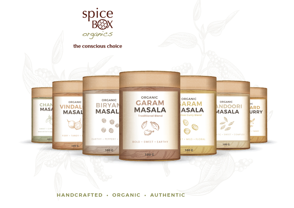
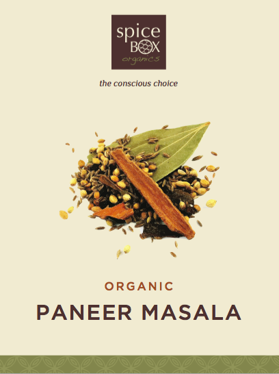
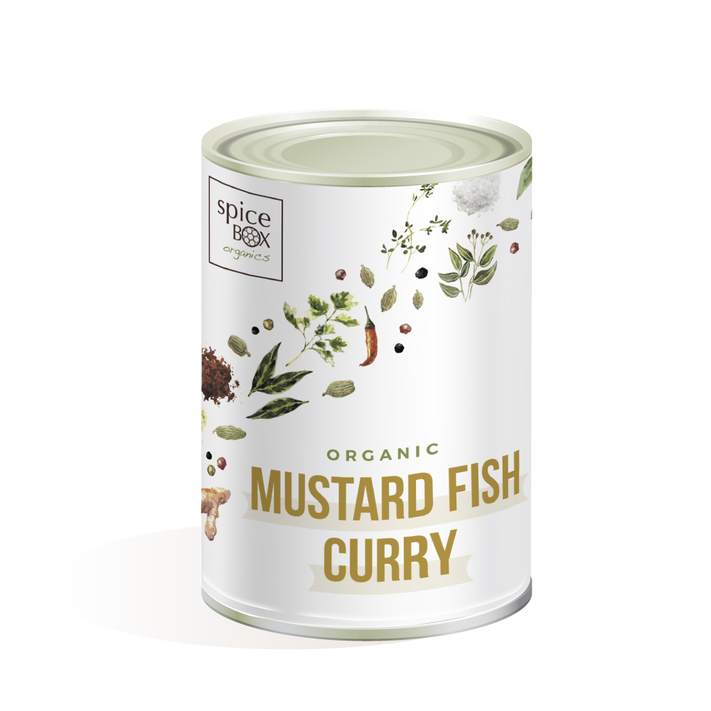
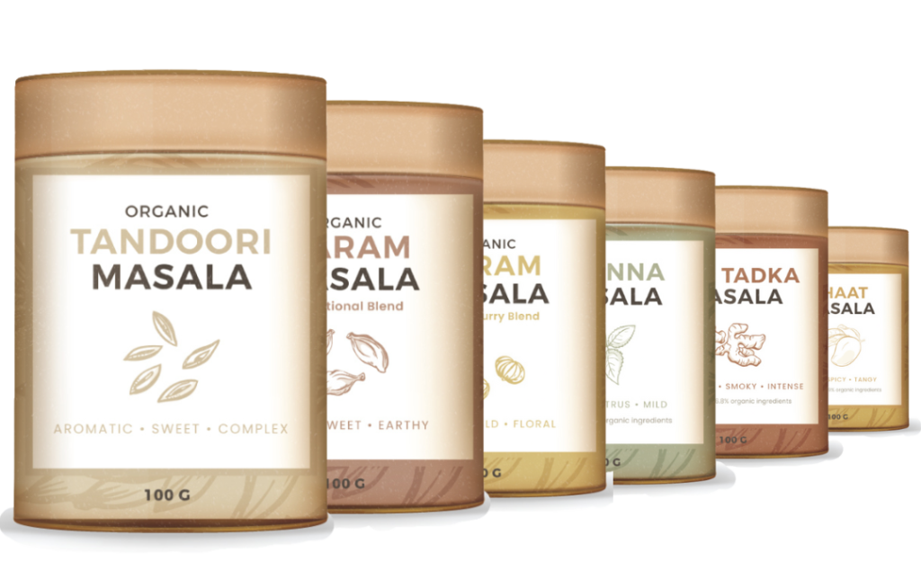
The main concept here uses a herbal-inspired backdrop in earthy tones and a crisp, clean label face with the dominant ingredient used as the illustration piece. Each of the blends also includes a QR code that leads to a specially-crafted recipe e-book as well (also crafted by me).
the whole story
SpiceBox Organics first came to me with a very handicraft basic design that had become outdated and dull. They wanted to revitalise sales of their in-house products and become a household name in spice blends, and they knew I had the capability to transform their brand slowly in a way to increase product visibility on shelves.
evolving the brand over time
The core elements of redoing a brand like this one would usually begin with a full redo of the logo and other elements. Due to the high costs of such a large-scale design renovation, we chose to take smaller steps and maintain the logo while marrying it with a new design language:
- Refine the colour palette into softer earth tones
- Simplify the logo by removing superfluous lines and boxes, and separate the tagline
- Introduce a new font pairing that speaks to the organic nature and the bold, fun side
- Redesign all in-house packaging (over 400 products) with a new design language that communicates a modern take on Indian influence as well as an elegant and versatile illustration style.
While work continues, we’ve come so far over the last few years with 100% of all packaging redesigned into Phase 2 and the above being the first into Phase 3.
ONWARD TO COMMERCIAL PACKAGING
Following the success of their in-house handcrafted spiceblends, snacks and other products, SpiceBox began experimenting with other new products they could launch in their vertical. The latest addition to the family, following in the vein of the new blends, are the tempeh products.
These have been redesigned to follow the kind of simple yet well-organised look you’d find from a higher-range British brand, for example. Elevated, yet accessible.
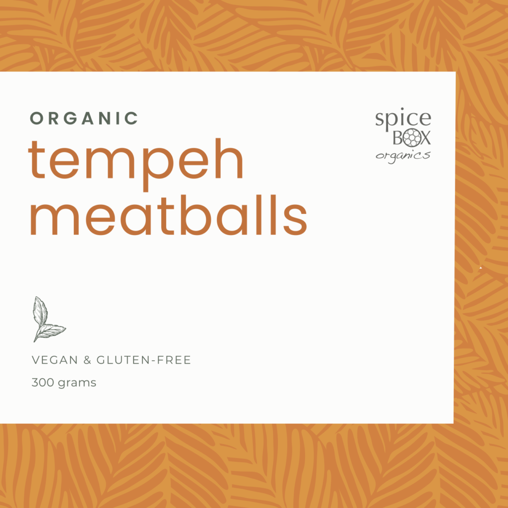
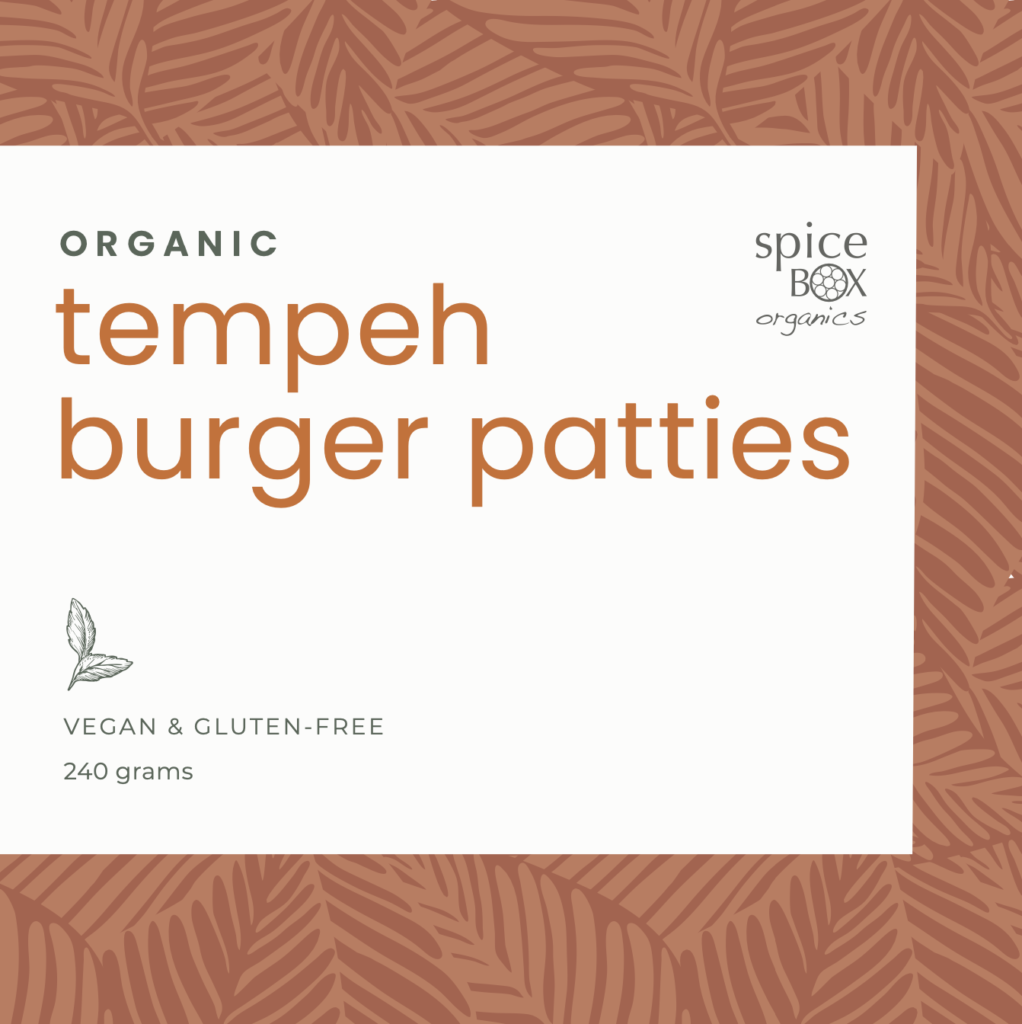
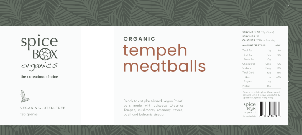
These were completed in mid 2023. More to come towards the end of the year.