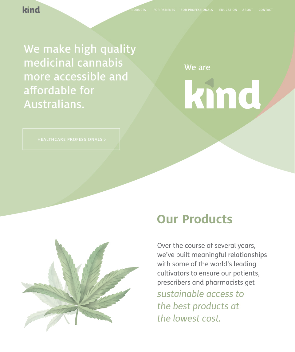
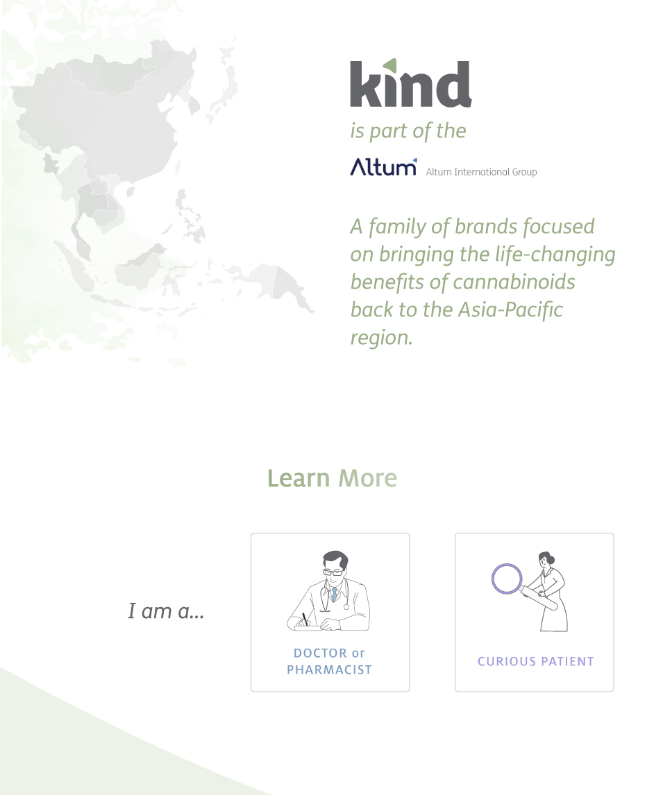
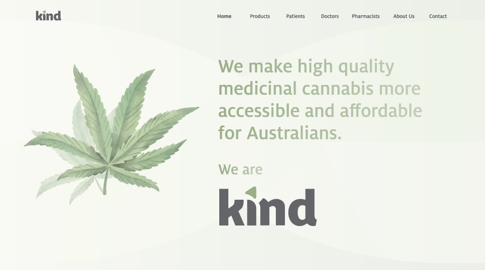
Kind Medical Cannabis is the largest provider of medical cannabis in the Asia-Pacific region, and I was delighted to be asked to work with them in developing the homepage for their newest refresh of the Kind Medical brand.
This was completed in Webflow (chosen by the client) over a period of approximately 2 months for initial development and 1 month of post-delivery revisions. Working with their originally well-designed logo and branding palette, the site was able to take on both a soft, approachable feel and a bold elegance that elevated the brand.
Also included is a fully-functional members-only portal for approved Doctors and Pharmacists where they can get high-quality information, product guidance, and learn more about the various strains Kind offers.
clean and reliable
With a no-frills approach and large use of whitespace, the Kind Medical team and I were able to develop a pattern system for the site that was both engaging and beautiful to look at.


project highlights
The experience of working with the Kind Medical team couldn’t have been better, and I’m proud of what we were able to achieve given the hefty restrictions around medical cannabis advertising in APAC.
- A gorgeous content-heavy homepage that flows with the reader and provides many pathways to learn more about Kind Medical
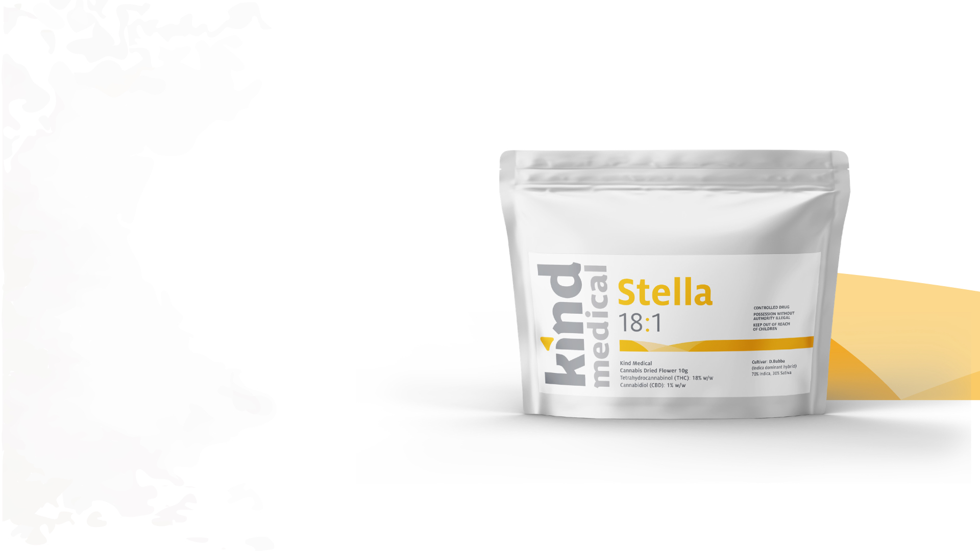
- Interactive and informative pages about Kind Medical’s products that both push the envelope in medical cannabis web design and remain within legislative guidelines
- A further development of the brand language into the web and app space
- A controlled and highly-informative Members Portal that allows for Kind Medical to showcase more information to sell more while adhering to national restrictions
As a medical cannabis user myself, I couldn’t be prouder of what this team is doing for the APAC region and the world at large. Of course, I also couldn’t be happier for having a small part to play in that.
Learn more and see the site in action over at Kind Medical.

